lokalein.kaufen
lokalein.kaufen [localshop.ping] was an independent, free of charge platform designed to support local businesses during the COVID-19 pandemic. It provided a simple online directory of local delivery and pick-up services for my hometown Celle in Northern Germany.
Simplicity is efficiency.
I voluntarily designed, developed, published and administered this platform. This documentation includes insights into the goals, analysis, research, design decisions, backend structure, public reception and a final conclusion.
Goals
The general goal of lokalein.kaufen was supporting the local economy and society (including residents in quarantine) in Celle. Based on this, two concrete objectives were defined:
- Simple connection: The platform ensures a lean and fast connection between customers and businesses, avoiding content overload and reducing incongruent data.
- Open exploration: The design encourages a fun and friendly discovery, creating a positive contrast to the global pandemic.
Analysis
Every business is different and every business works with different variables. While there are many individual content types, some of them overlap.
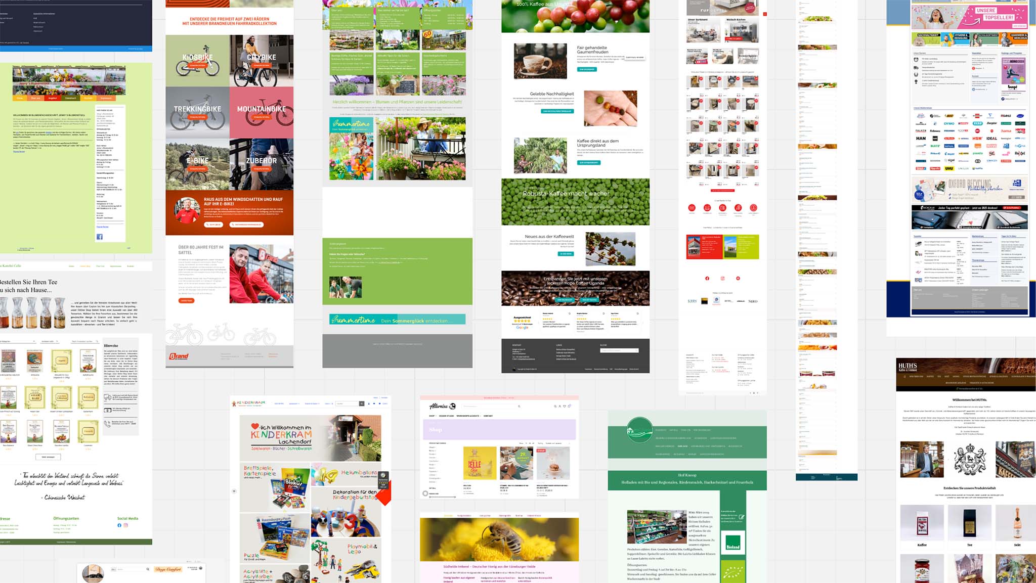
To accommodate this diversity while maintaining the autonomous consistency of the information for reaching the first goal, the platform focused on providing enough content and functions – but not too much.
Content
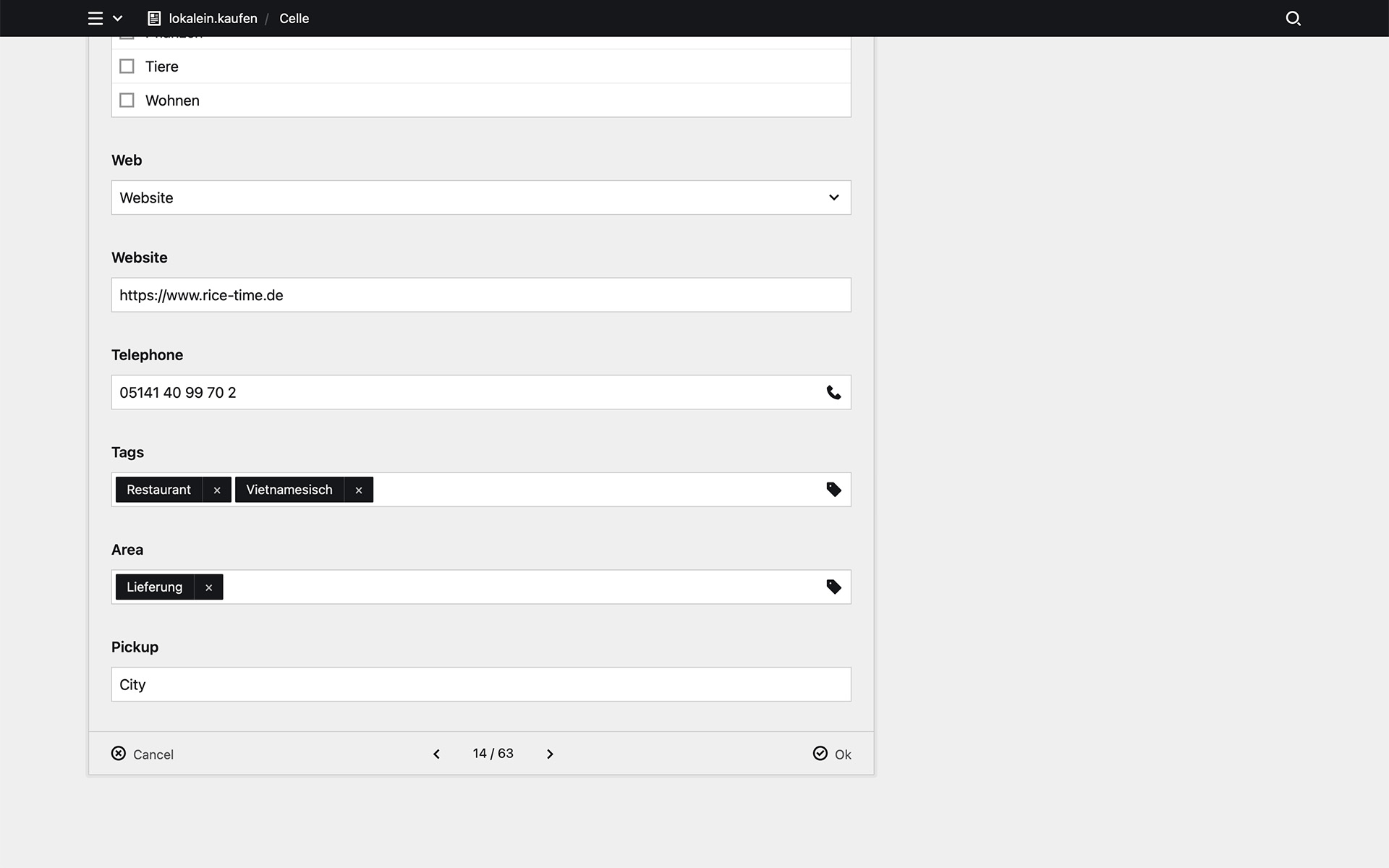
- title for identifying the business
- link for immediately connecting with the business
- phone number as additional means of contact (crucial for smaller businesses in Celle)
- tags for revealing the business areas
- shipping options (pickup or delivery) for customers in quarantine
Functions
- clickable link for establishing the connection
- clickable phone number for establishing the connection
Research
By gaining broad perspectives, several design considerations were explored and ultimately selected. For example:
- Grid: While a traditional list was considered (and even used for the simple start of coding), it was too boring. Instead, a grid layout was more dynamic and engaging, meeting the second goal.
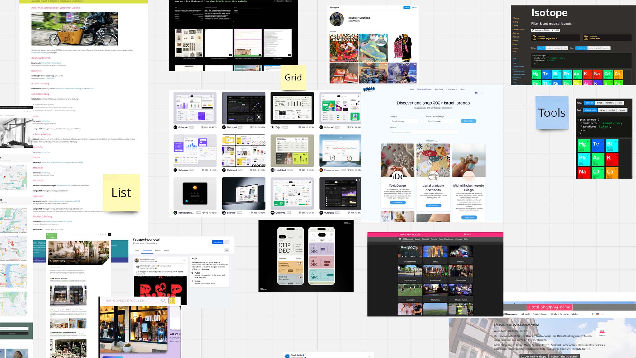
- Responsive: The design needed to be responsive to ensure seamless functionality across various devices and screen sizes.
- Minimalism: Although visual elements like images could enhance the visual appeal, concerns about rapid obsolescence, frequent updates and copyright issues led to prioritizing a simpler, text-based design.
Design
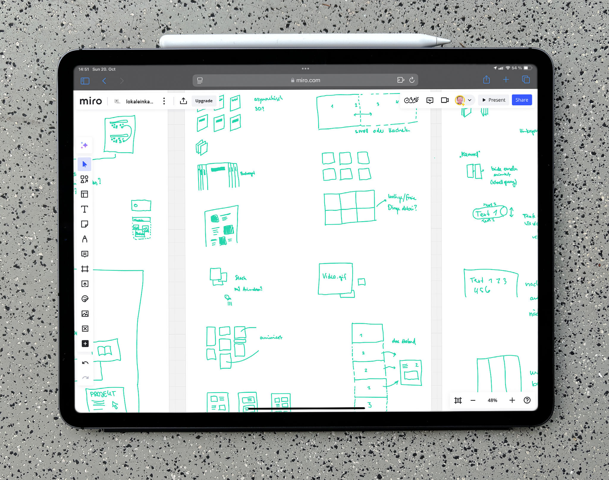
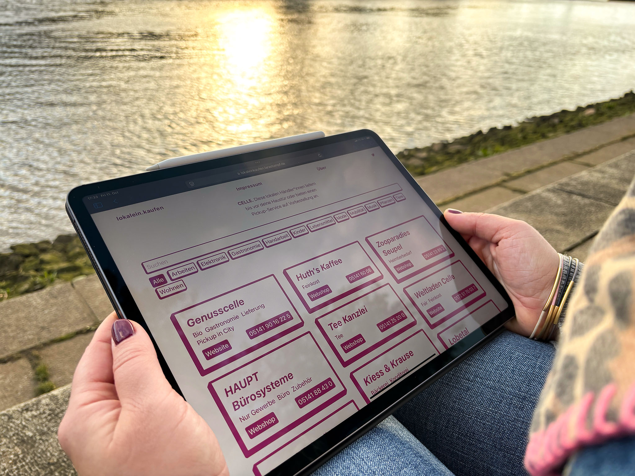
Based on analysis, research and several initial ideas, the layout was designed as a responsive grid with tiles to meet both project goals: simplicity and enjoyable exploration.
Tile
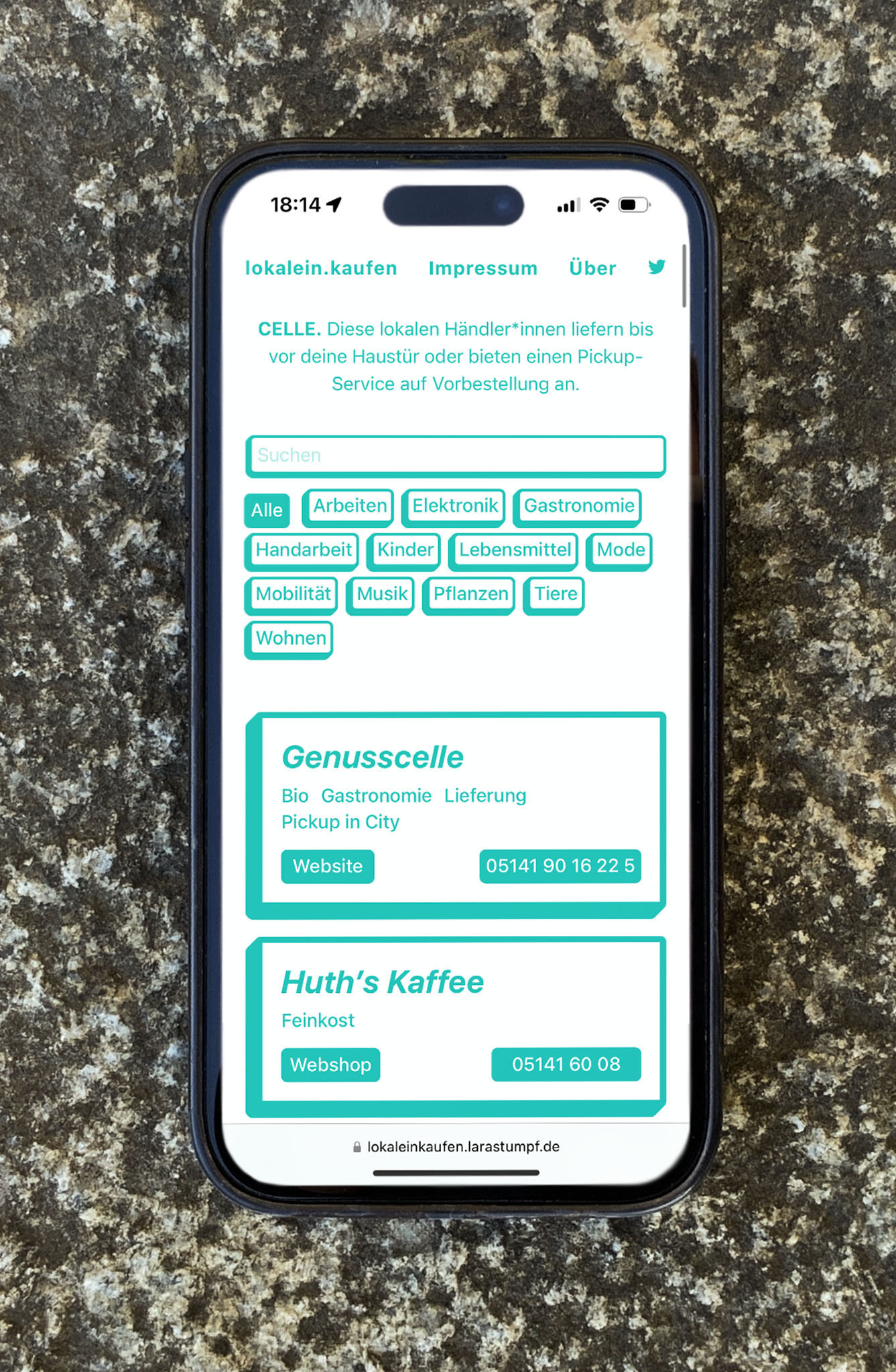
Each tile presented essential information vertically: title, details and contact information. This vertical alignment allowed users to quickly scan the information within the border of the tile.
- Title: The name was displayed prominently to ensure clear identification.
- Details: Lower-priority information, such as tags or secondary details, was displayed in smaller, less emphasized text.
- Contact information: Though positioned below the details, contact links were visually highlighted to emphasize their importance.
This straightforward layout fulfilled the first goal of enabling simple and fast connections between customers and businesses. To meet the second goal – encouraging enjoyable exploration – the design took on a casual tone. A playful font, subtle 3D effects and animated color gradients gave the interface a friendly and relaxing vibe, which contrasted with the stressful backdrop of the pandemic.
Grid
The minimalist tiles were arranged in a responsive grid with up to three columns. Arranging the tiles chronologically instead of alphabetically kept the most recent updates at the top, making the platform more engaging for returning visitors.
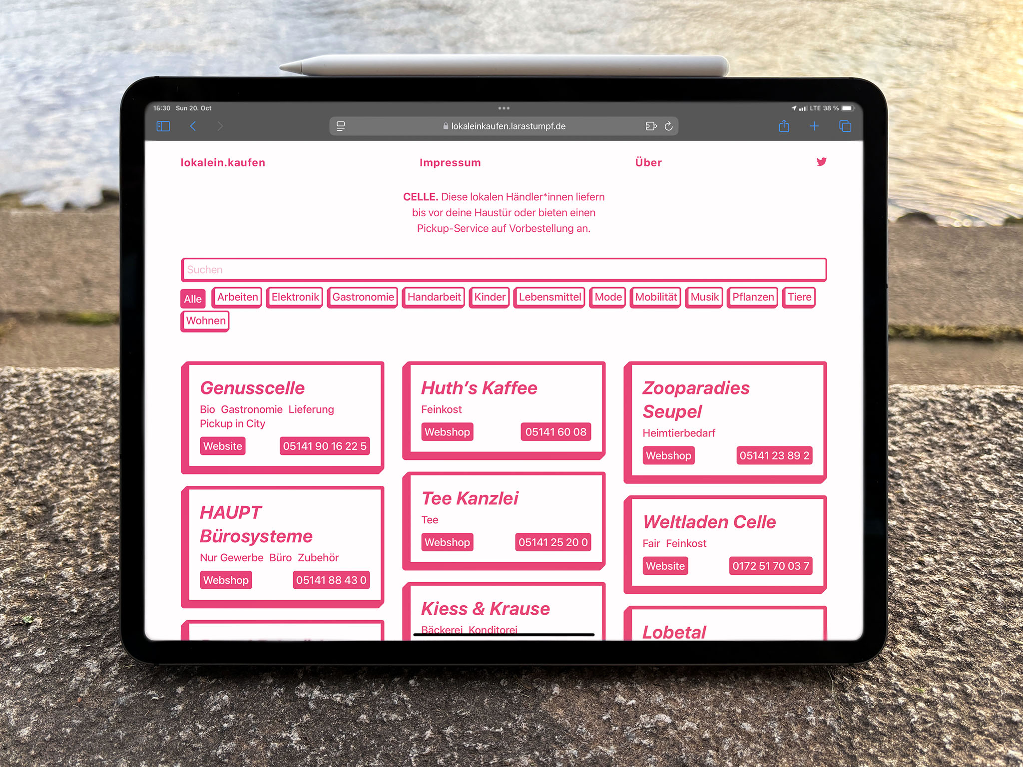
As the number of listed businesses grew, navigation became increasingly important. Two key features were introduced based on research:
- open search offering a free filter
- filter tags suggesting possible categories and making them easy to find
These features, combined with the clean and playful design, ensured the grid supported both simplicity and enjoyable exploration.
Page
The overall layout was completed with a clean, concise header, that introduced the purpose of the platform. Essential links to additional details and social media were included, ensuring users had easy access to further information. This minimal yet informative structure contributed to a cohesive and user-friendly design.
Backend
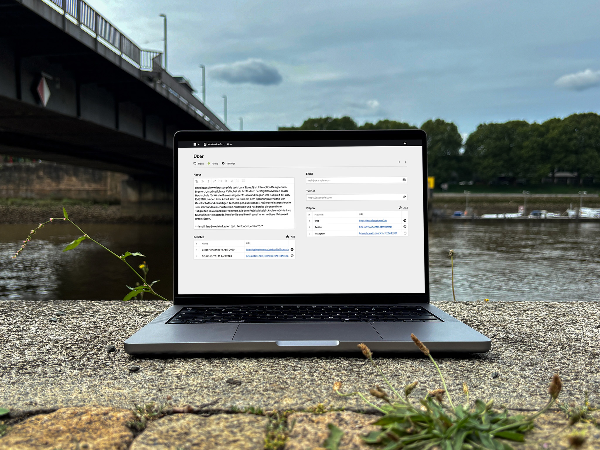
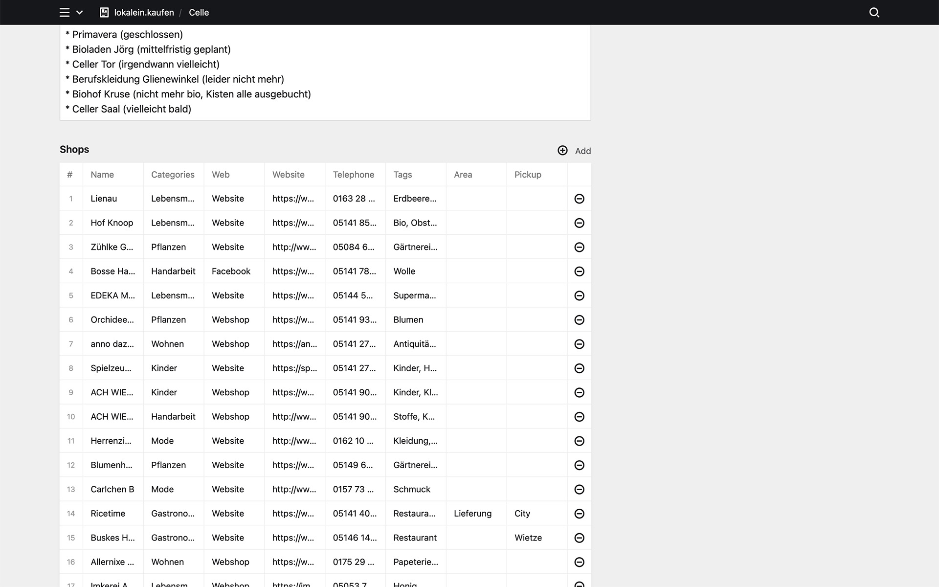
The backend was built with Kirby, a lightweight and flexible CMS. It was as clean and simple as the platform itself, ensuring easy management and scalability to potentially add more cities and users to the system.
Public (Selection)
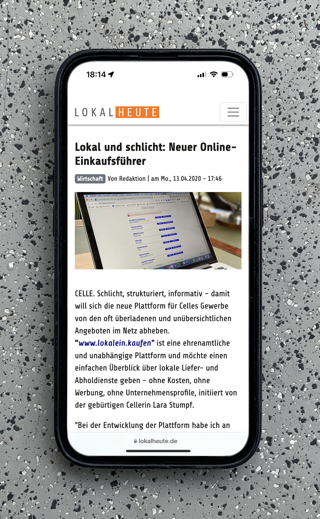
lokalein.kaufen received positive feedback from local buyers and sellers alike. Despite efforts by the city administration and the largest local newspaper to exclude the project from broader publicity, it resonated deeply with the community. The playful yet functional layout stood out as a refreshing alternative to the cluttered, complex online platforms.
- Celle heute: “Lokal und schlicht: Neuer Online-Einkaufsführer” (2020)
- Möbel Wallach: “#supporteachother: Gemeinsam durch die Krise” (2020)
- Social Media: several mentions (2020–21)
Conclusion
During the COVID-19 pandemic, lokalein.kaufen was not just another business directory or advertising platform; it was a free resource that connected local businesses with residents in a time of need.
Connections mean profit.
Through my design process, I broke down the topic, made informed decisions and interacted with both businesses and the public. The final minimalist yet playful design successfully achieved the goals while fostering a sense of community solidarity.
Learnings
- Lack of collaboration with the city government and the local newspaper: Despite the potential for mutual reinforcement, the city Celle only promoted its own detailed and therefore alphabetically sorted and hierarchically structured database. Similarly, the largest newspaper Cellesche Zeitung chose to ignore a different, complementary approach. It was very disappointing, as it missed the value of diverse goals and ideas. This experience reinforced the importance of collaboration and openness to alternative viewpoints. I will stay open to diverse perspectives as they often lead to richer outcomes.
- Experimental freedom: Free from economic constraints, the decision to sort the listings non-alphabetically proved to be effective and meaningful. For future projects, I will keep an open mind and embrace experimental approaches, as they can lead to unique and effective solutions.
- Inclusive design: While the website was designed to be fun and engaging, it faced challenges with accessibility. Ensuring that all users can fully access and enjoy my work will be a top priority in future projects.
- Data minimization: Focusing on essential information was not only a practical choice given my limited time and resources but also a strategic one. By providing only the most essential information, businesses had the autonomy to manage and update their data independently. This was an interesting perspective for the balance between different roles in a project.