Accessibility Kiwi
My perspective on design underwent a profound shift in 2021 after meeting individuals who rely on accessible products. This experience sparked a deep commitment to accessibility, leading to the creation of Accessibility Kiwi – a reformatted and explanatory guide to WCAG 2.2, providing the right information at the right time throughout the design process.
Digital products should
be usable for everyone.
No exception.
As the author, designer and developer of this guide, I am proud of the positive feedback Accessibility Kiwi has been receiving. This documentation will take you through the background, education, analysis, research, goals, design, backend and the conclusion.
Certificates & Publications
- W3C Certificate: Introduction to Web Accessibility (2021)
- Publications: Medium (2023–now), @access.kiwi (2023–now)
- Mentions: Kirbysites (2023)
Background
We are living in the 21st century and electronic devices have become integral to our daily lives. Our world is filled with unique people with different needs in different situations. Imagine sitting outside in the sun, easily reading this text thanks to optimal color contrast or resizing it effortlessly. You might be doing that right now – practical, right?
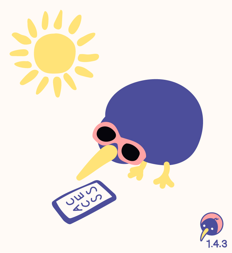
By embedding accessibility into design and development, we contribute to a more inclusive web. And – if we need to convince businesses to invest – we increase sales (and much more). However, accessibility is not just a short workshop; it is an ongoing commitment. Accessibility Kiwi was born from this idea: making the Web Content Accessiblity Guidelines (WCAG) – authored by the people who rely on them – an inherent part of the design process.
Education
Meeting people with disabilities “irl” was the catalyst for my deep dive into accessibility. The W3C’s “Introduction to Accessibility” course provided profound insights into the everyday challenges. However, this was just the beginning. For truly grasping the impact on design decisions, every single criterion of the WCAG was analysed.
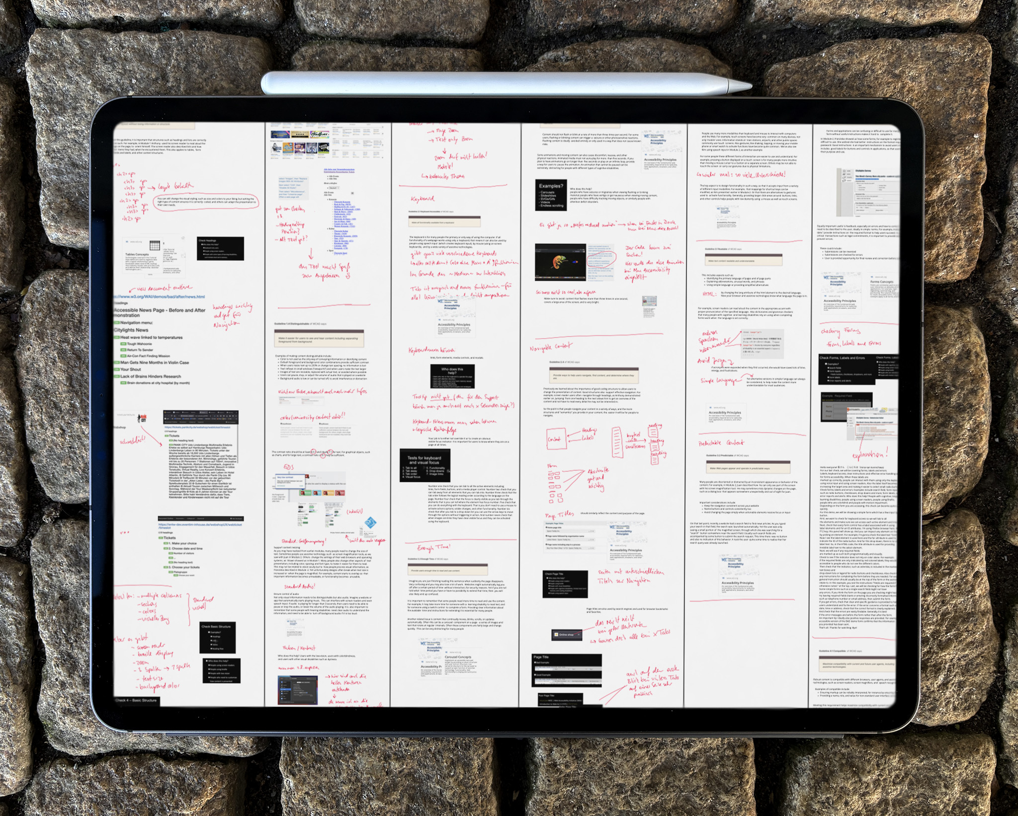
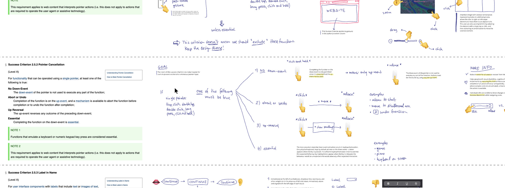
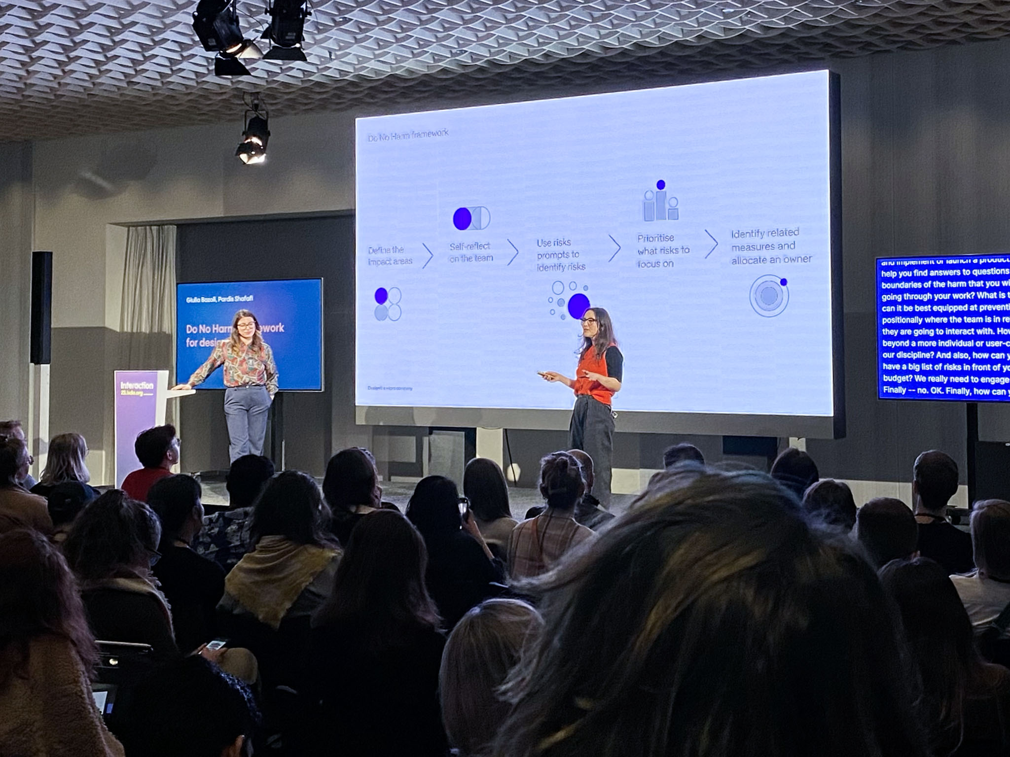
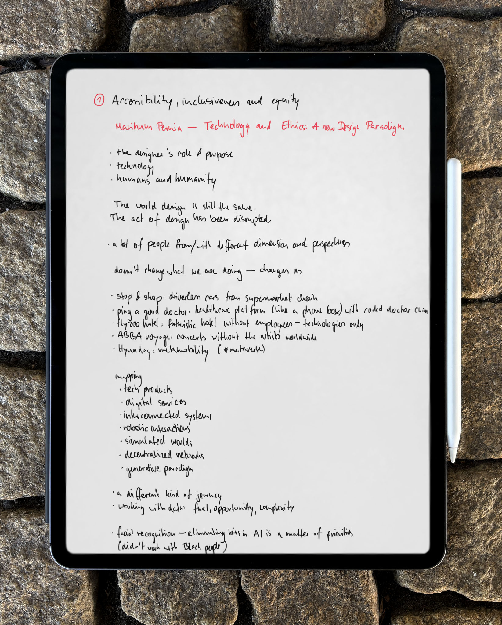
Accessibility is a continuously evolving field, with regular updates to guidelines and new legal regulations. This journey from basic knowledge to in-depth expertise has revealed how crucial it is to have the right information at hand at the right moment.
Analysis
The large number of criteria contains a variety of information. Some are simple, some are complex; some are relevant to designers, some to other areas. The most important variables for designers are:
- name for identifying the topic
- level (A, AA, AAA) for indicating its importance
- number for official communication
- link to WCAG for easy access to official documents
- brief comment for explaining the impact on the design
- tags for revealing the topics and filtering
- explanation of the relation to design
- explanation of the relation to development (optional)
- original description to clarify uncertainty
Research
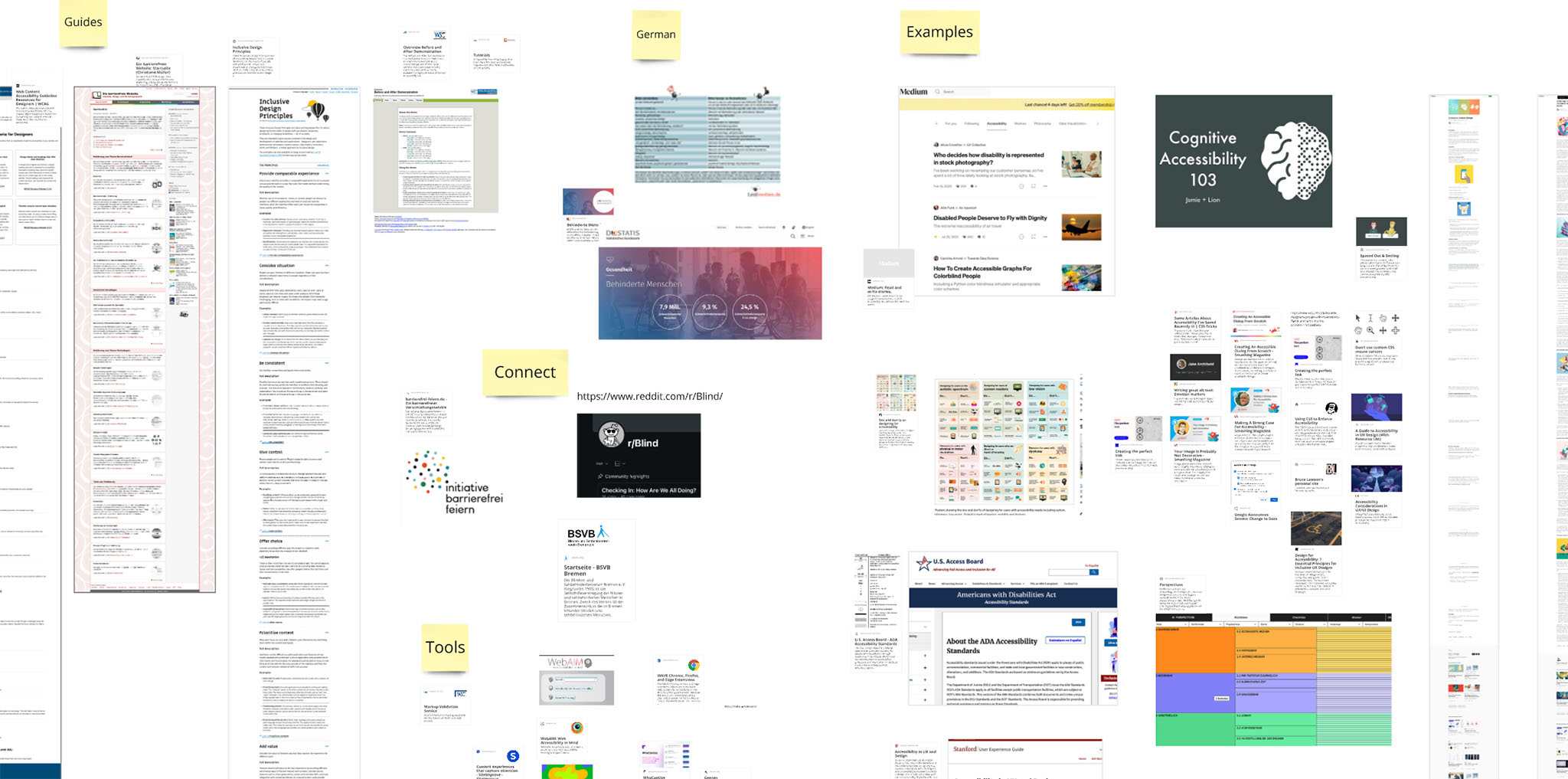
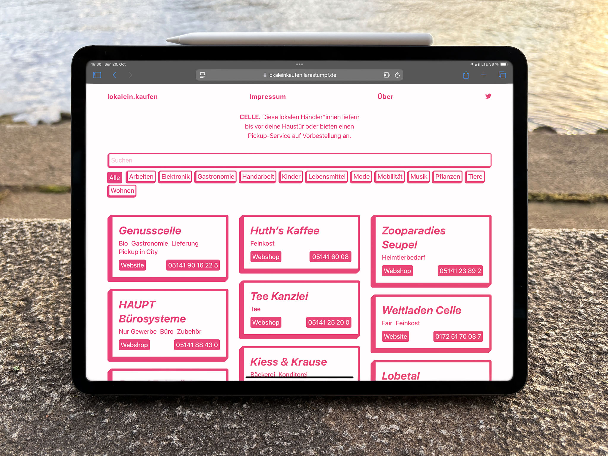
Most accessibility guides and articles only scratch the surface, lacking the depth needed for efficient implementation. In contrast to my previous minimalistic project, lokalein.kaufen [localshop.ping], the extensive amount of information needed for this guide demanded a different approach. However, several useful features were identified:
- show and hide a large amount of content for quick insights
- single pages for sharing and bookmarking specific criteria
- open search across the entire content for finding individual keywords
- filter for authored navigation
Goals
The main goal of Accessibility Kiwi is to seamlessly integrate the WCAG into the design process, ensuring that nothing is overlooked. The secondary goal is to raise awareness, encouraging more designers to adopt accessibility standards at the right stages of their work.
Authoring
- Each criterion is easy to understand.
- Descriptions are brief and focused on the design process.
- Examples are ideas, no prefabricated solutions.
- Content is based on the current WCAG 2.2.
Visualisation
- Relevant criteria are easy to find.
- Each criterion is easy to understand at first glance.
- Details are easy to locate.
Design
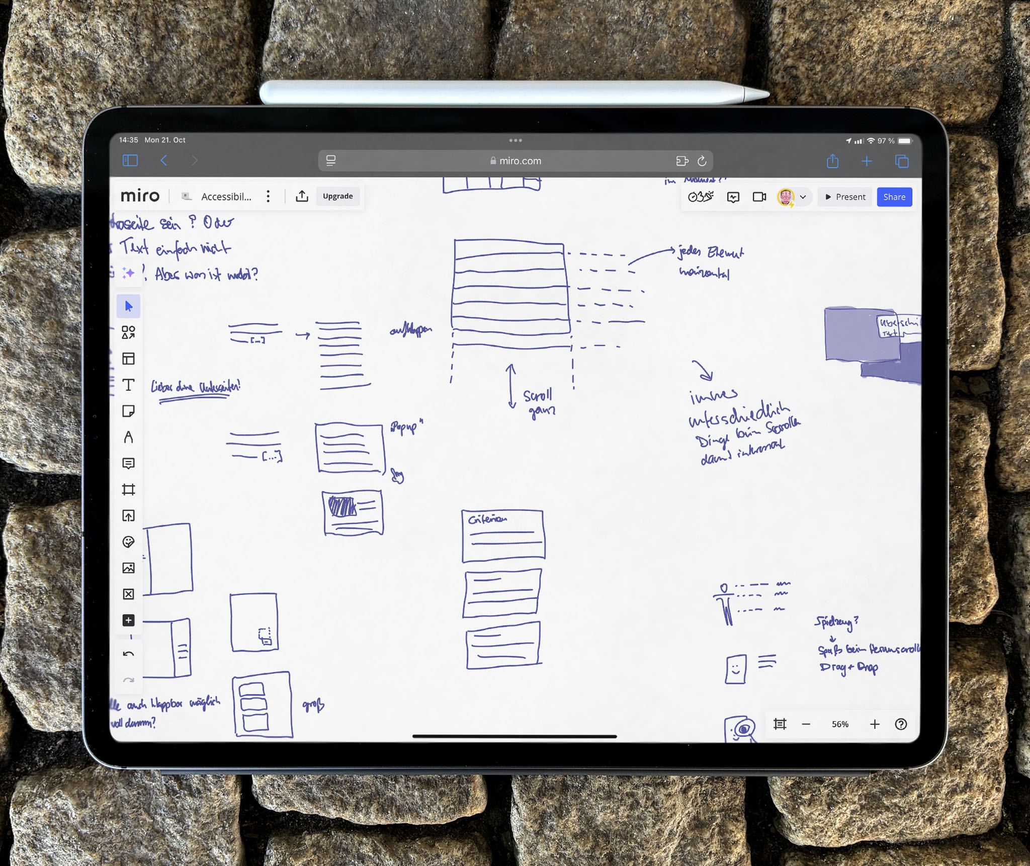
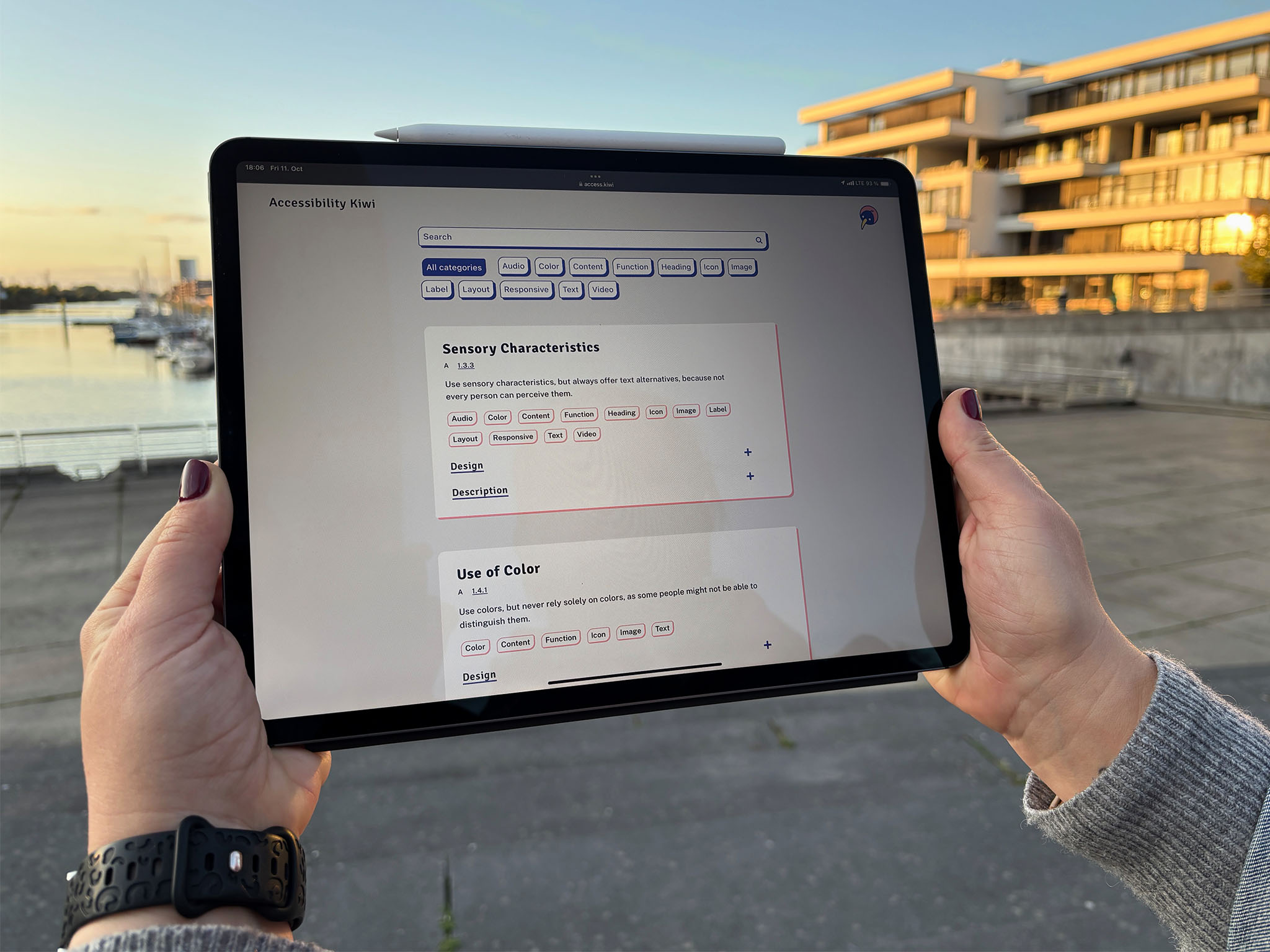
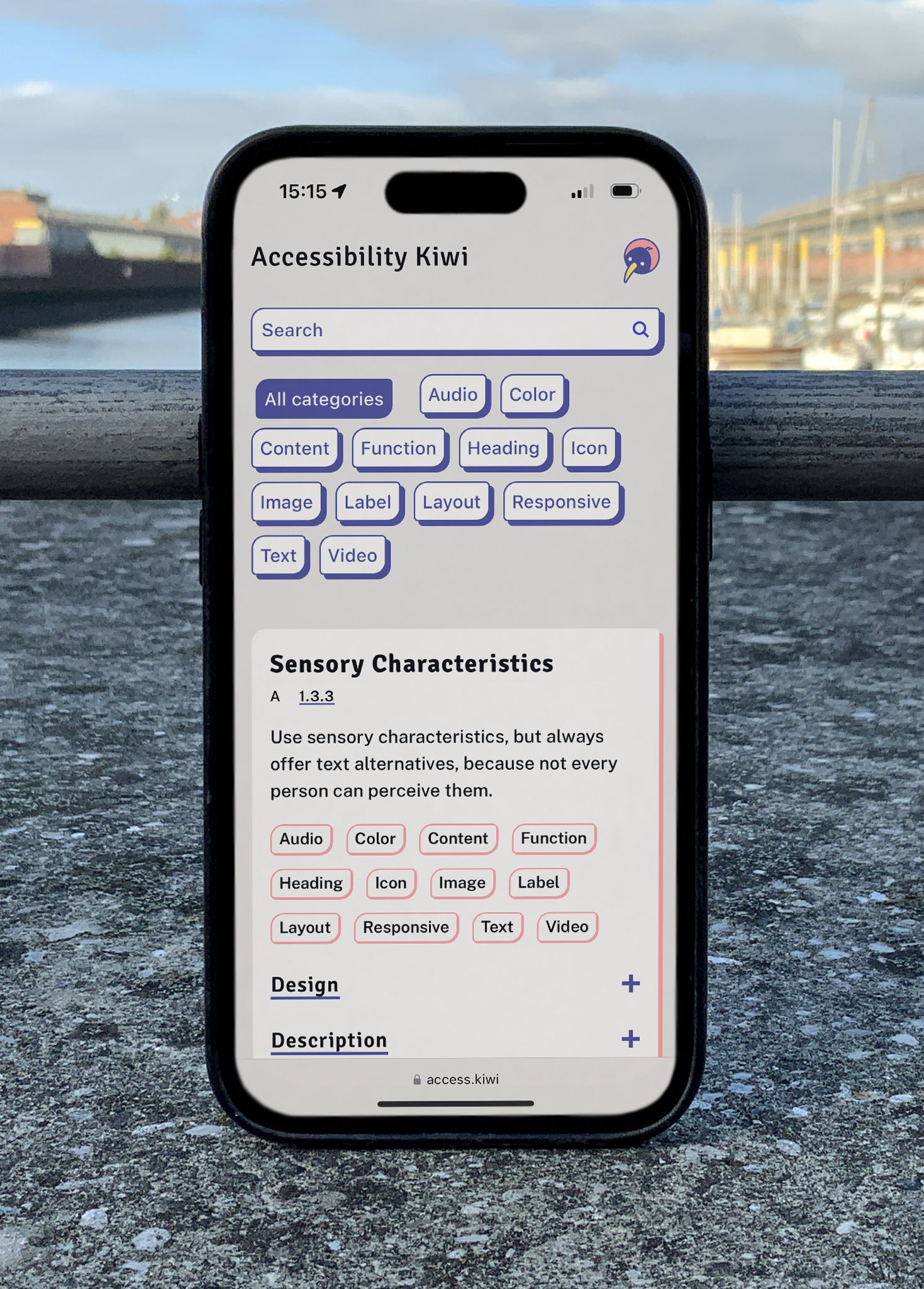
Designing Accessibility Kiwi required a thoughtful approach to present each criterion clearly and organize extensive content for easy navigation. Ideas evolved throughout the project, leading to a vertically aligned layout that placed the criterion design at the forefront. The iterative process involved key decisions across various elements, with insights into the headline, accordion, grid, search, keyboard navigation and enhancements in the following section.
Headline
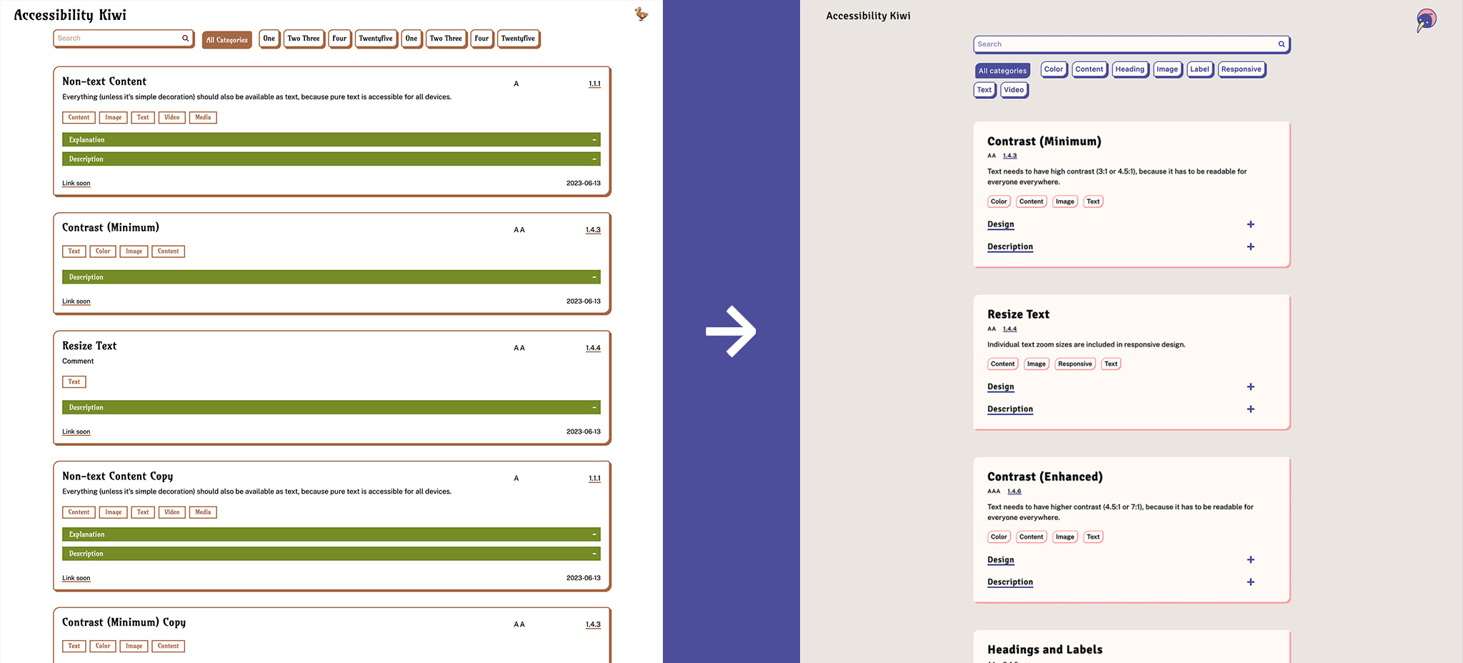
To make the level and number easily scannable relative to the name, the headline needed flexibility to handle varying amounts of content.
- First approach: Positioned level and number at the top-right corner of the card for easy visibility.
- Problems: Limited space on responsive screens and long titles.
- Solution: Straight alignment at the second position in reading order, supported by distinct typographic styles.

Accordion
Details need to be shown and hidden without interrupting filtering and scrolling. Scanning a lot of content is easier with less interruptions.
- First approach: Used a strong background to make details stand out.
- Problem: While effective for a single criterion, it was distracting when applied to a large collection.
- Solution: More subtle design and icon to clarify the function.

Grid
The large number of criteria requires careful organisation of how they should be listed to make them easy to find.
- Alignment: Criteria are sorted vertically by number to ensure nothing is overlooked and to align with standard WCAG sorting for international collaboration.
- Width: Content width was optimised for readability, despite the extensive amount of information.
- One page: All criteria are displayed without pagination to support uninterrupted reading and searching, with lazy loading for media to maintain performance.
Search
The search function identified during analysis was incorporated at the top to aid initial navigation. While finding the right criterion is essential, reading content undistracted is equally important.
- First approach: Positioned search sticky at the top of the page.
- Problem: Occupied excessive space and proved distracting during reading.
- Solution: Integrated the search function above the static filter.
Keyboard Navigation
Accessibility requires full support for keyboard navigation, underscoring the importance of accessible development.
- Problem: Accordion could not be opened or closed via keyboard.
- Solution: Fixed the VanillaJS code with ChatGPT.
Enhancements
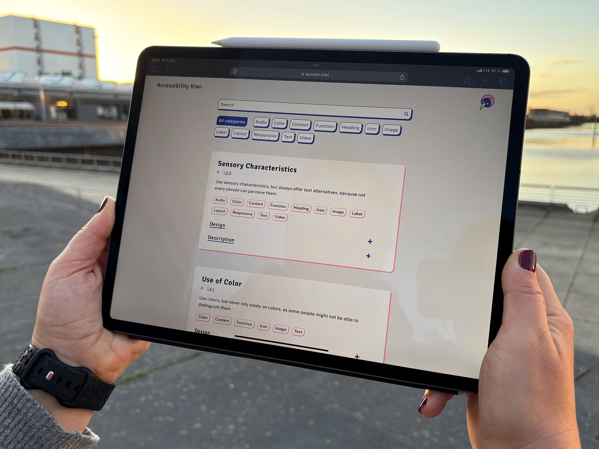
During testing, several enhancements were added. A filtering tool enables users to sort criteria by tags, allowing them to quickly locate relevant information throughout the design process. Tags are also visible on each criterion, for quick insight into specific impacts.
As users scroll through a criterion, the sticky title remains visible, ensuring users can easily keep track.
Each criterion has its own single-page view with navigation links to previous and next criteria, making comparison and bookmarking straightforward.
Tooltips display the destination of external links on hover, enhancing usability for cursor-based interactions.
Backend
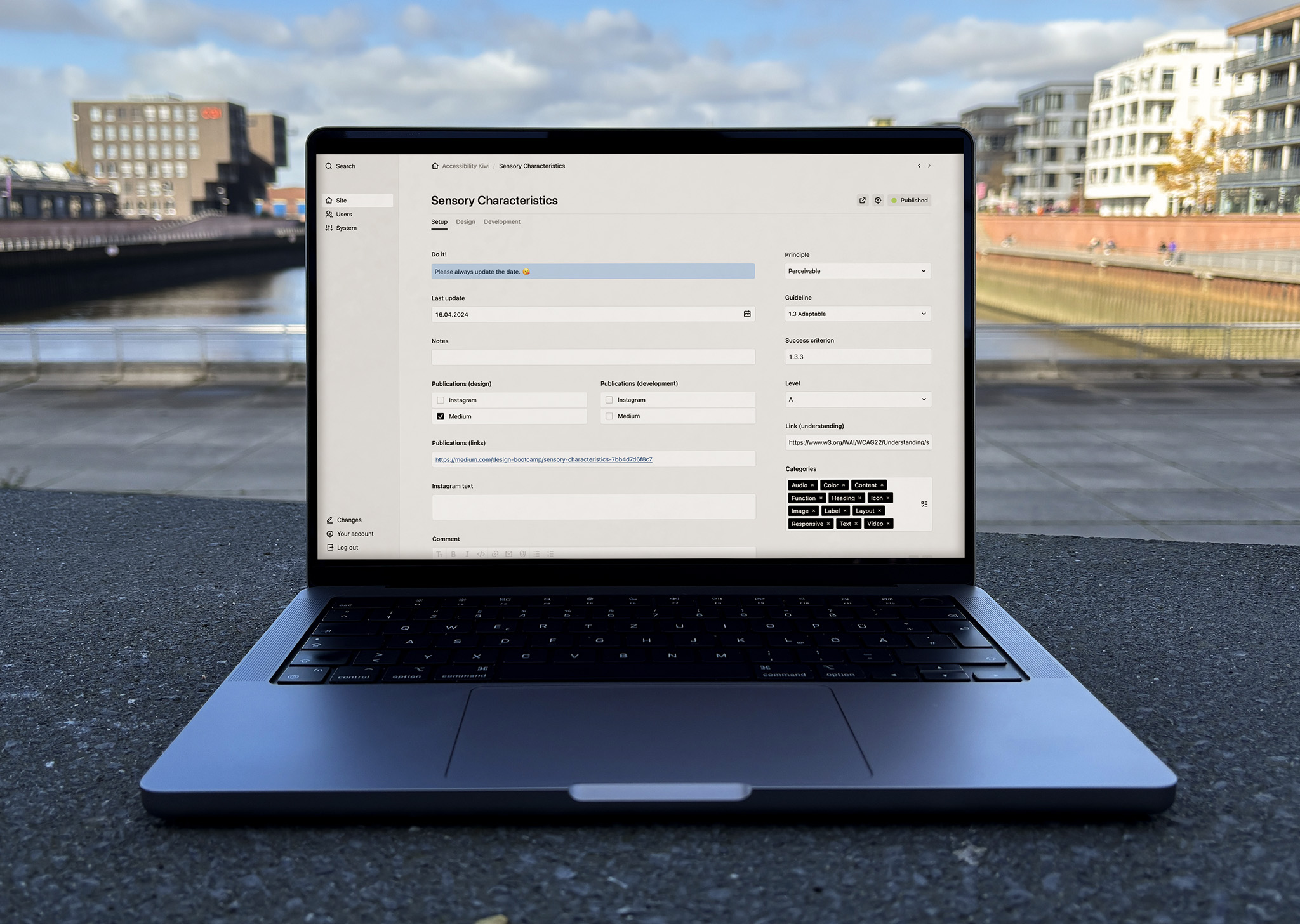
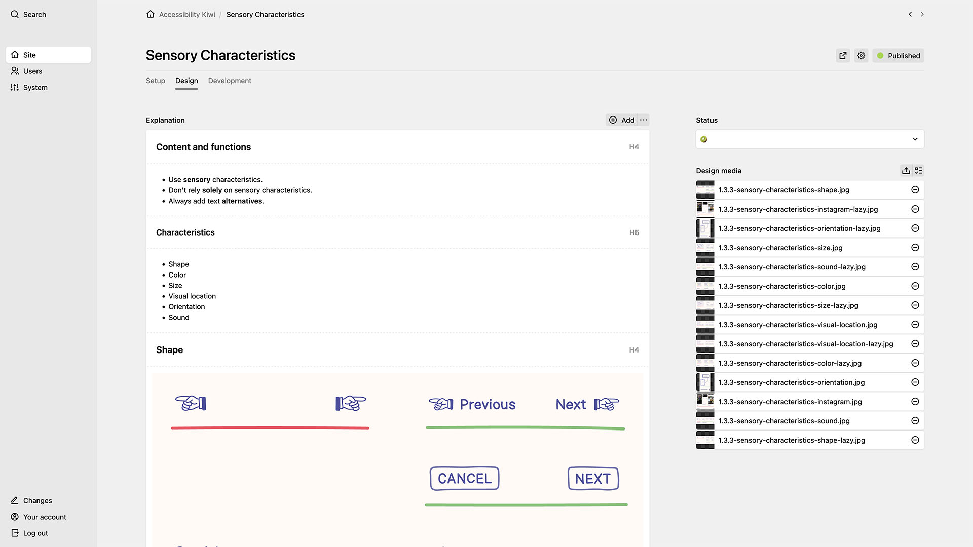
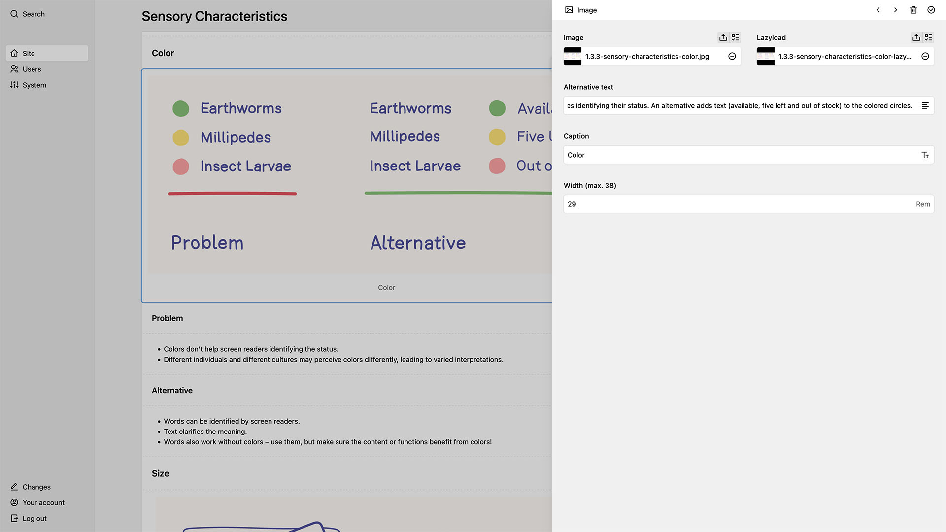
The backend was designed for efficiency in content authoring and note-taking. The simple, minimal hierarchy structure was developed with Kirby, a CMS that allows for easy customization. Key features include:
- Criteria pages: Each criterion has a dedicated page, divided into sections for basics, design description and an optional development description.
- Dashboard: The basic table provides an overview of essential variables, accompanied by a text field for free-form notes.
Conclusion
Accessibility Kiwi is the culmination of a deep dive into accessibility, from foundational education and detailed research to goal-oriented design and backend development. This guide goes beyond simplifying WCAG 2.2; it serves as a comprehensive, well-organized tool that makes accessibility a natural part of the design workflow.
Learnings
- Growing expertise in accessible design: As an author, I have been learning a lot about accessibility, realising that many others are still at the basics rather than delving into details or keeping up with new trends. I will continue learning and expanding my knowledge.
- Publishing is important: Simply putting content online and “waiting” is – obviously – not enough. Active promotion is necessary to raise awareness and encourage other designers. And it works: articles are receiving positive resonance and increasing the page views. I plan publishing more content and spreading the word even more to increase awareness and knowledge.
- Understanding the project management perspective: Striving for perfection can be counterproductive, and a project does not have to be perfect to be very good. Even though this project is not primarily focused on business results, I have learned that sometimes products need to be launched first and refined later (but not be ignored). I will apply this balance between perfectionism and efficiency in my future projects.
Next Steps
Looking ahead, I plan to continue contributing to a more inclusive web, ensuring digital products are accessible to everyone, without exception.